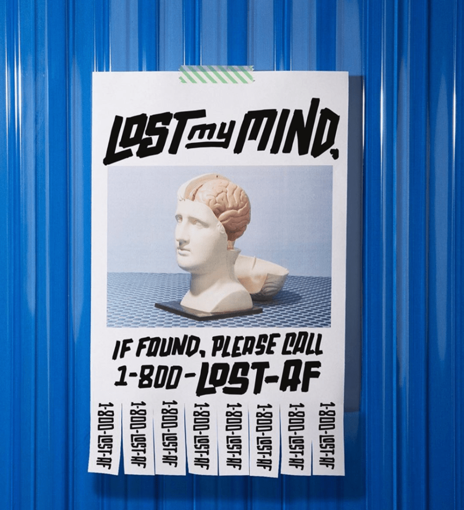
This piece is one that I categorize as a good digital design. It follows the CRAP design principles in with good contrast, repetition, alignment and proximity overall. The design uses contrast by creating a bright blue background behind the white paper. Using a darker color behind the white made it pop and stand out more. Repetition is used in the pull off numbers by repeating the phone number 8 more times after presented under the picture of the fake human and brain. Alignment is shown because the poster is centered in the page as well as the spacing of the photo and type on the page, They all start and end with a similar distance from the edge of the paper. Finally, proximity is shown by putting all of the type on the page along with the phone numbers vertically on the bottom of the paper. Walsh is keeping all of the text and symbols together and leaving the background an open space to make it seem as if this poster is hanging on a wall.
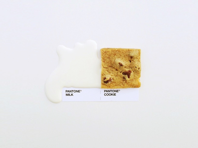
This design was interesting to me because it uses food and other items to recreate paint samples. While they all follow the CRAP principles of design this one was simply my favorite. The cookie on the page creates a contrast from the white background, milk and white labels. The cookie stands out and draws attention to the piece more than the other elements. Repetition is used with the labels because it repeats the style and brand label before mentioning the name of the food and drink that are represented. Alignment was used in this piece by placing the items and labels in the center of the page. Proximity is used by putting the food and drink together and putting the labels together. The space that is left behind the two items creates visual space that creates the idea of a wall in my mind.
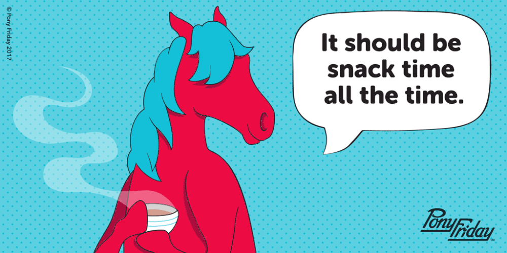
I chose to talk about this design because I thought it was funny and relatable because I love to have snacks throughout my day. Hom created this design after as a quote from herself during an interview about her inspirations and designs. It follows the CRAP principles of design with contrast by making the horse hot pink and the speech bubble white. The colors draw attention and pop from the blue background of the image. It follows repetitions with the pattern of the background and alignment with the text in the speech bubble. The text is centered in the speech bubble. Finally the design follows proximity by leaving enough space between the horse and the speech bubble so that you are aware where its coming from, but not so close that it is touching. It groups everything together in by action.
