For the second to last gate of Creating multimedia content we were asked to produce a video mimicking the tv show survivor. We were to use interviews and b-roll shots in order to tell the audience what they need to do to survivor Com 210 and 220. The answers we wrote were to portray different questions like what is some advice you would give an upcoming student, what was challenging and what did you enjoy. The final video should be helpful to students thinking about taking these courses in the fall or anytime in the future.
Production book
For the last project in our creating multimedia content we were asked to produce a video using the theme thankful. I asked my friends and family the question “What is something you’re thankful for?” and used their responses to edit the video together. I organized the video together by keeping the responses of friends and family together and added the different responses before and after. At the end of the video I incorporated a few clips of things that I am thankful to have in my life to tie it all together.
Living Portraits
For this assignment we were asked to take 20 different video portraits of people. I spent my Sunday with family, so decided it was the perfect time to capture the portraits I needed. A lot of the videos were taken in downtown Baltimore as i walked with my mom and sister. Others were taken when we went to see my cousins and around dinner when my aunt came to eat with us. Overall the process was really fun and it was cool that I had such a range of people and places that I was able to record.
Audio Adventure
During this section we focused on learning how to manipulate and use audio in the Adobe Premiere app. We were assigned multiple different project and tasks that we could interpret and create to be unique to us.
Task 9: Poem Project
Overall, this project was my favorite to complete for this section. I thought that the poem Kindness by Naomi Shihab Nye was very beautifully written and related to our lives right now more than we would recognize at first glance. Getting a group of people willing to read was a lot easier than expected so I was able to include 6 friends and family in my project. The editing was a lot more precise and difficult then the other tasks and projects but the work was definitely worth it at the end of the project.
Project 1: Two Soundscapes
For project one we were assigned to create two different soundscapes using music and sound effects. I created one using familiar sounds you would hear at the beach such as airplanes, wave, boats and people laughing and talking. While making this soundscape i had to cut and re-listen to the piece after every change I made, but overall I think that it completed the project to the best of my ability with the videos and resources I had available.
For my second soundscape I used sounds that you would hear at a sports event such as a football, soccer, or hockey game. The sound is supposed to make you feel like you are attending a game, even when right now sports are suspended. The sound is supposed to give you a memorable experience.
Project 2: Tell a Story
For Project 2 we were asked to tell a story through audio. Being home, I have limited people that enjoy being interviewed or recorded because they are often trying to spend time alone, so i decided to read a section of the book Helter Skelter by Vincent Bugliosi. The book tells the true crime stories from Charles Manson’s cult followers, which is a story that I have been interested in reading about for the past few years. The section that I read was about Bobby Beausoleil murdering his friend Gary Hinman over money that was owed to Manson. I used music and sound effects to add character to the reading. I used my phone’s voice memo app to record the reading.
Project 4: Produce a Commercial
The audio commercial that I produced for this project talked about the Coronavirus. It was a short PSA with directions and information about the global pandemic. I used music and sound effects to add sound other than my voice into the audio, making it more interesting. I used the voice memo app to record my script.
Coronavirus Campaign
The goal of this assignment was to create four different advertisements that could be used in campaign. We were challenged to design 4 different sized items that worked out to be a website mock-up, a poster, a postcard and a business card. With the instructions of these four dimensions we were able to interpret and create a design. I focused on the current event of the Coronavirus and how it is spread to others and how you can keep yourself healthy.
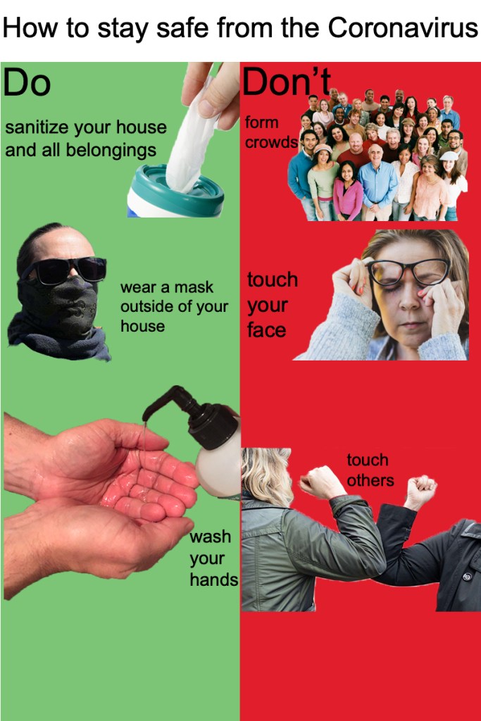
The first visual I created was a website mock up in which I depicted what you should and shouldn’t do during the current outbreak of COVID-19. I was trying to focus on how people are preventing the spread and how others are ignoring regulation and rules and putting other in danger. I wanted to split the screen in order to show that there were two sides and arguments to be made. Along with a few short words, I used pictures to show because it is most times easier to interpret information from a photo. I used my personal photo to portray washing your hands on the “Do” side of the website.
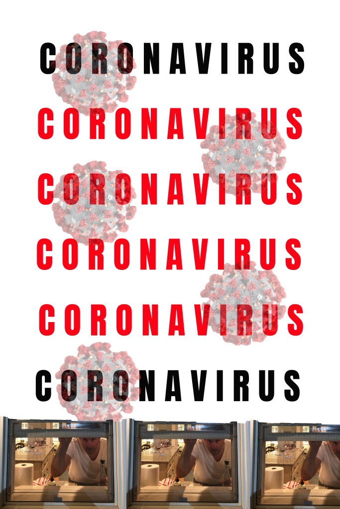
Secondly, I created a poster that could be used to gain awareness for people who are unaware of the sickness. I wanted to use a simple design to attract peoples attention but not overwhelm the page with design. I used a repeating text and the shape of the virus as well as an original picture intended to represent staying inside.
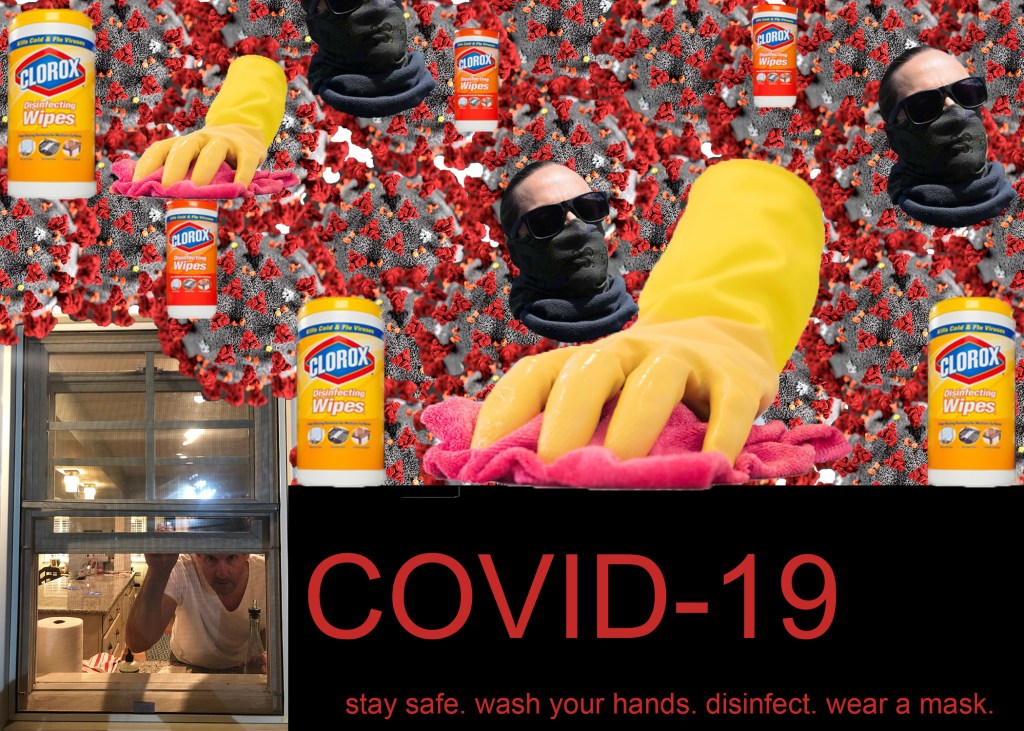
Next I created a postcard that was intended to give information about my topic. I decided to complete this using mostly images which is what comes to mind when I think about a post card. I used repeating images to complete the collage on the upper half of the post card and finished it using an original photo and text to explain and give recommendations.
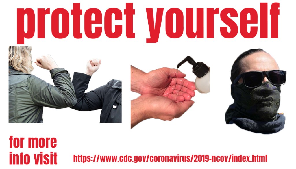
For the final design I created a business card intended to spread awareness in a simple way. I chose a bold font to display “protect yourself” because I have come to realize that is the most important part of this virus. Second, i chose to use three picture that i thought were the most important instructions that the CDC and government are telling us to do which are: don’t touch one another, wash your hands and wear a mask when you go out. I included the link to the CDC’s website with information in case viewers have more questions.
Three Digital Designs
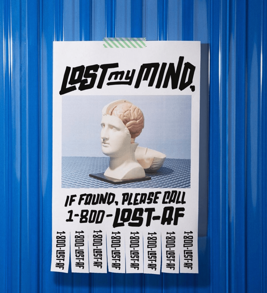
This piece is one that I categorize as a good digital design. It follows the CRAP design principles in with good contrast, repetition, alignment and proximity overall. The design uses contrast by creating a bright blue background behind the white paper. Using a darker color behind the white made it pop and stand out more. Repetition is used in the pull off numbers by repeating the phone number 8 more times after presented under the picture of the fake human and brain. Alignment is shown because the poster is centered in the page as well as the spacing of the photo and type on the page, They all start and end with a similar distance from the edge of the paper. Finally, proximity is shown by putting all of the type on the page along with the phone numbers vertically on the bottom of the paper. Walsh is keeping all of the text and symbols together and leaving the background an open space to make it seem as if this poster is hanging on a wall.
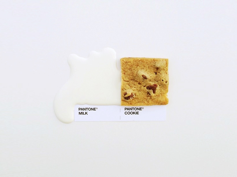
This design was interesting to me because it uses food and other items to recreate paint samples. While they all follow the CRAP principles of design this one was simply my favorite. The cookie on the page creates a contrast from the white background, milk and white labels. The cookie stands out and draws attention to the piece more than the other elements. Repetition is used with the labels because it repeats the style and brand label before mentioning the name of the food and drink that are represented. Alignment was used in this piece by placing the items and labels in the center of the page. Proximity is used by putting the food and drink together and putting the labels together. The space that is left behind the two items creates visual space that creates the idea of a wall in my mind.
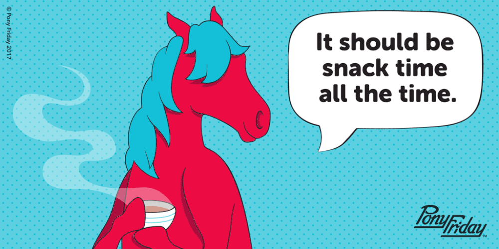
I chose to talk about this design because I thought it was funny and relatable because I love to have snacks throughout my day. Hom created this design after as a quote from herself during an interview about her inspirations and designs. It follows the CRAP principles of design with contrast by making the horse hot pink and the speech bubble white. The colors draw attention and pop from the blue background of the image. It follows repetitions with the pattern of the background and alignment with the text in the speech bubble. The text is centered in the speech bubble. Finally the design follows proximity by leaving enough space between the horse and the speech bubble so that you are aware where its coming from, but not so close that it is touching. It groups everything together in by action.
Logos
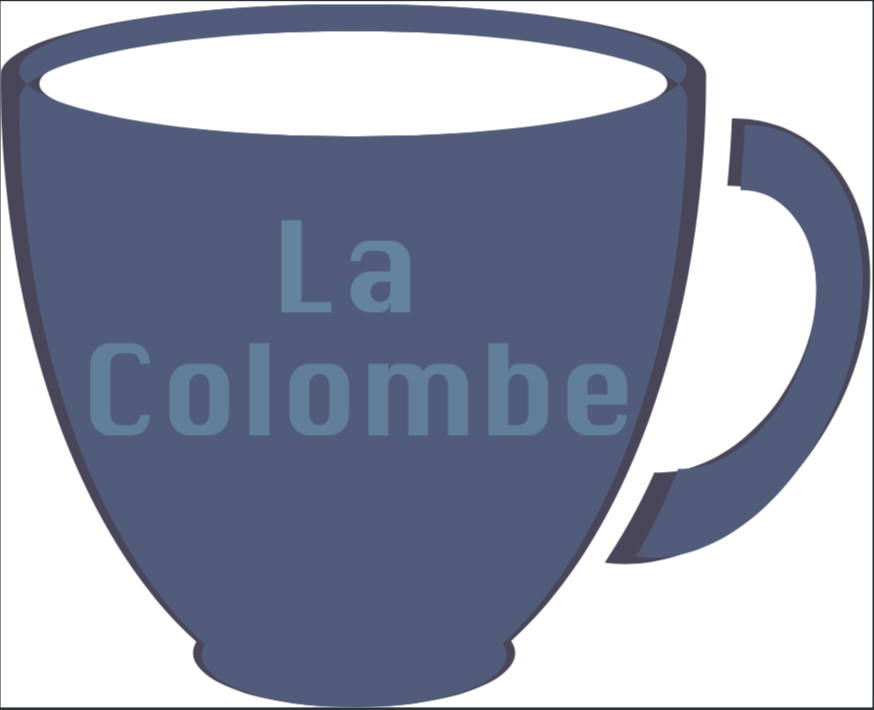
I created two logos from the elements given to us. The first logo that I created is a personal logo for myself that is supposed to be cheerful and happy. The second logo that I created was for a coffee brand called La Colombe. I love coffee so I wanted to incorporate it into a logo.
Infographic
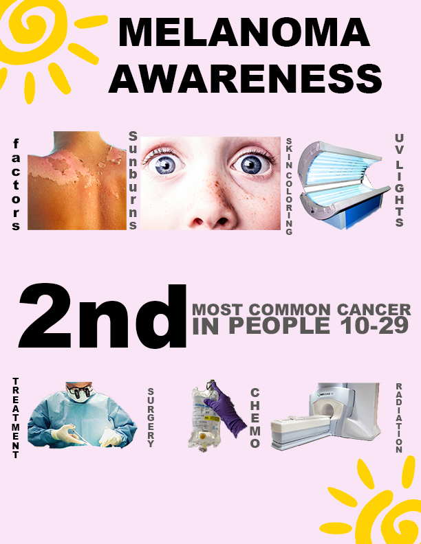
The Infographic that I created is intended to spread awareness and information about Melanoma, a type of skin cancer. The first line of data that I have displayed is the different factors that have been proven to lead to skin cancer which are a history and frequency of sunburns, people who have fair skin, blue eyes and freckles are more at risk and exposure to UV lights.
Secondly, I added what age group of adolescents are most likely to develop a form of skin cancer or melanoma. Doctors have concluded that it is the second most common cancers in people from 10-29 following behind Leukemia.
Finally, I incorporated different ways that melanoma can be treated by doctors. The severity of each persons case decides how they will be treated. Most often diagnosed patients have a biopsy surgery before undergoing further treatments such as chemotherapy and radiation.
I decided to create my infographic about melanoma because it is a something that most people our age don’t consider when exposing themselves to the sun or UV lights.
Collages
Kate Moross + Studio Moross
Kate Moross is a graphic designer and artist based in London, England. She has created her studio, Studio Moross, which creates art and designs for brands all over the country. The studio and its artists have helped artists like One direction, the Spice Girls and Sam Smith with different projects over the years. Studio Moross prides themselves on collaboration and the ideas and work that all of the artists brainstorm and create together. They use experimental methods in order to solve problems and create work that they are tasked with. The studio was built from Kate’s passion for working with others to create amazing work.
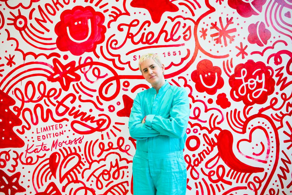
Kate and her team use their talents to create amazing designs for brands. As an artist Kate uses her talents through moving imagery, typography, and illustration which she creates for many different reasons. One of her pieces that stuck out to me the most was part of a campaign she did with Kiehl’s. Kiehl’s is a cosmetic brand based out of the united states that Moross worked with in 2015.
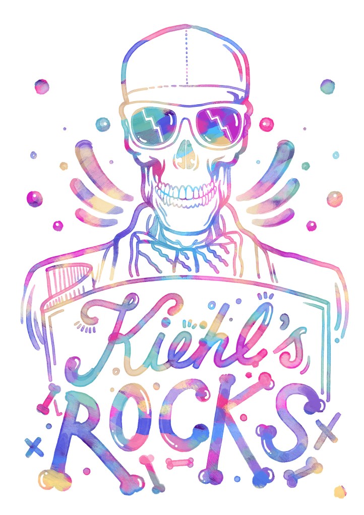
I was attracted to this design because i created something similar in my design class first semester. The washed colors that she used for the over all coloring reminds me of a water color painting. The typography that she used for the word “rocks” was interesting and attention grabbing because it reminds me of dog bones, which would have nothing to do with a skin care company. I think that overall the creation behind this piece is amazing and turned out beautifully.
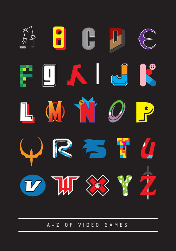
I also greatly admired the work that the Studio Moross team published with the alphabet of video games. While I would not categorize myself as a “gamer” I believe that Kate’s work with typography is exceptionally amazing and attention grabbing. The incorporation of design into the typography was specifically compelling to me when looking through her work.
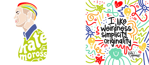
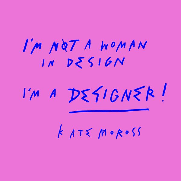
The attraction that I have to Kate and her studio is similar to a role model. While she is a phenomenal artist in my opinion, I also greatly admire her work ethic and strength as a woman. Graphic design is a work field made up of a majority of men like most industries today. I believe that she has worked her hardest to create a positive image for bother herself and her company through everything they produce. She has grown from a small company to one that artists and larger companies rely on to produce amazing work and art for their brand. Kate Moross is one of the most influential designers that I have read about.
